SREB Takeaways on Teacher Compensation Data
Trends and highlights from our 2023 analysis. 2024 coming soon!
 Teacher compensation is about more than just salaries. Each year, we track and analyze the full package of teacher compensation data across the 16 states in the SREB region — from salaries to health care and retirement benefits to net take-home pay.
Here we highlight key takeaways from our most recent compensation analysis.
TEACHER COMPENSATION DASHBOARD
Updated! Dive into your state’s data or compare across states
TEACHER WORKFORCE DATA
A summary of preparation, diversity, turnover and more across the South
Below: Explore key takeaways on teacher compensation in the South
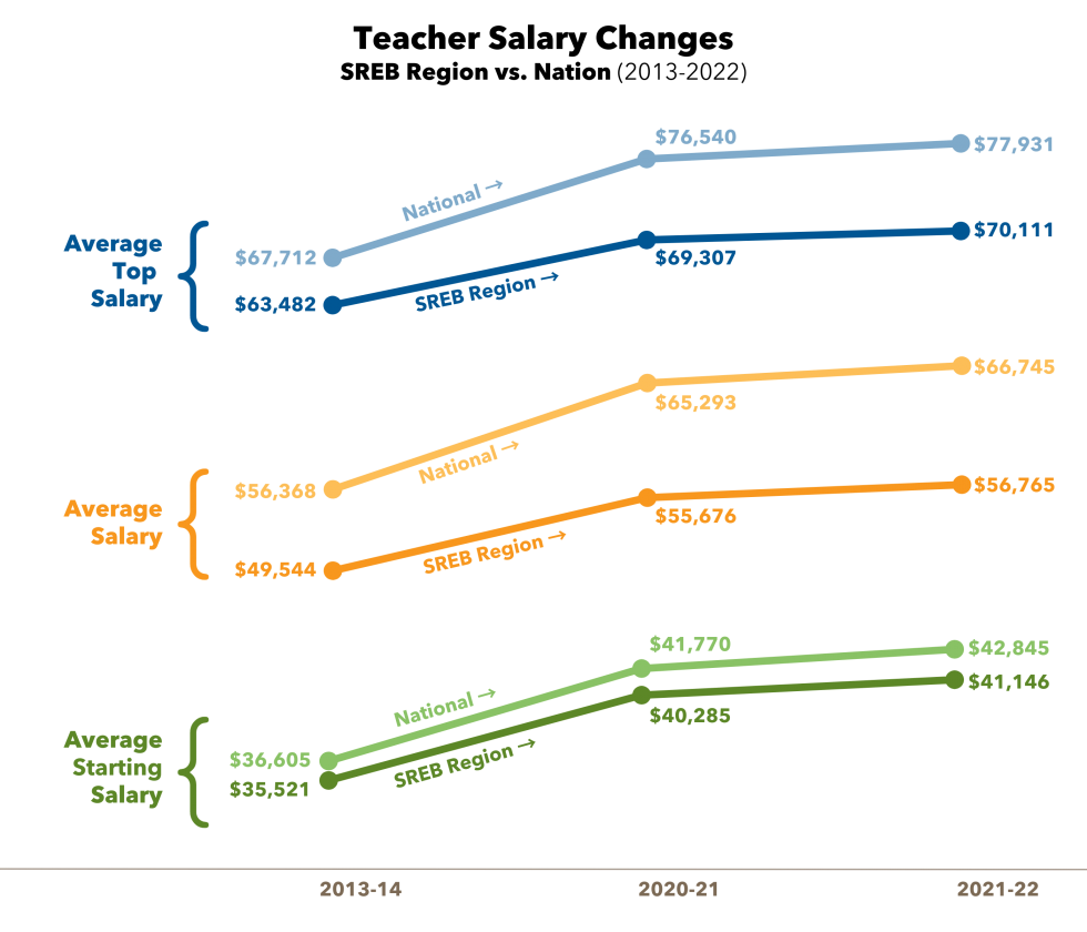
Average Teacher Salaries
Average starting salary, average salary and average top salary vary across the SREB region.
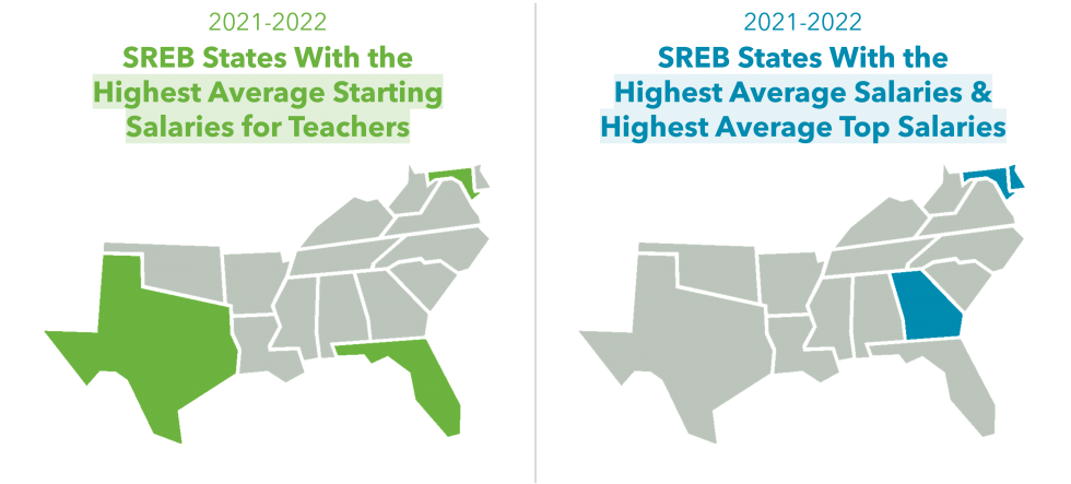
Despite a cost of living index that averages 91% in 2022 (compared to 100% for the nation), the South lags significantly behind the nation in overall teacher salaries — paying 15% less than the national average.
Explore more state-by-state teacher salary data using the Teacher Compensation Dashboard.
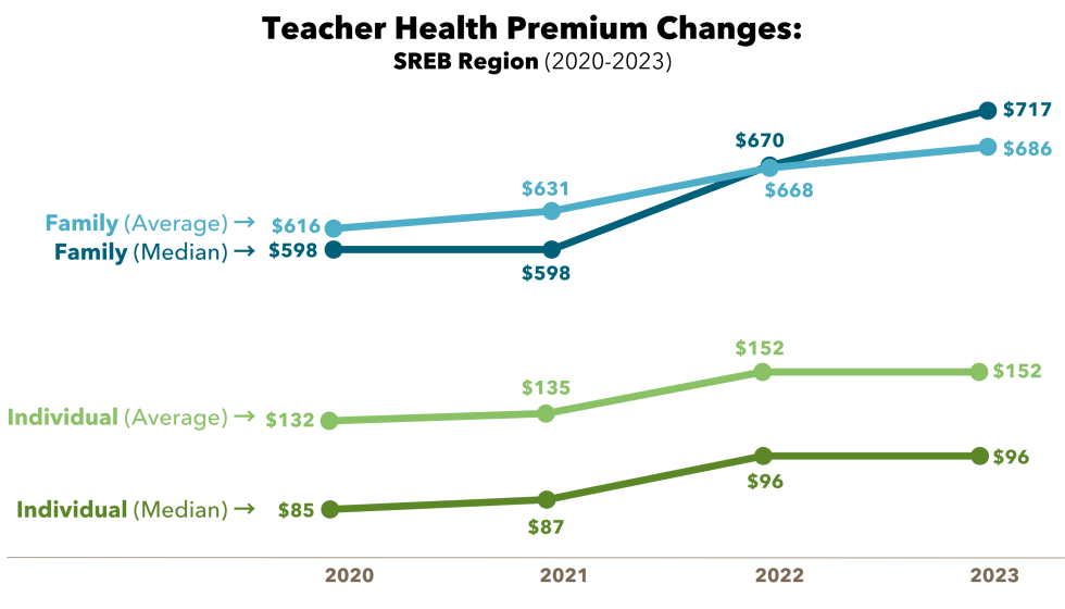
Teacher Health Benefits
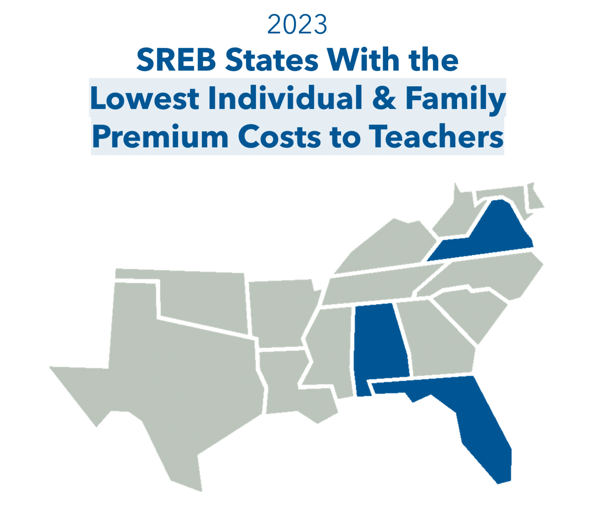
In 2023, SREB states were able to maintain the same average premium costs for employees, yet family coverage costs increased. The chart below shows changes to average and median premiums for health benefits (for both individual and family plans) in SREB states. You can also use the Dashboard to further explore state-by-state data.
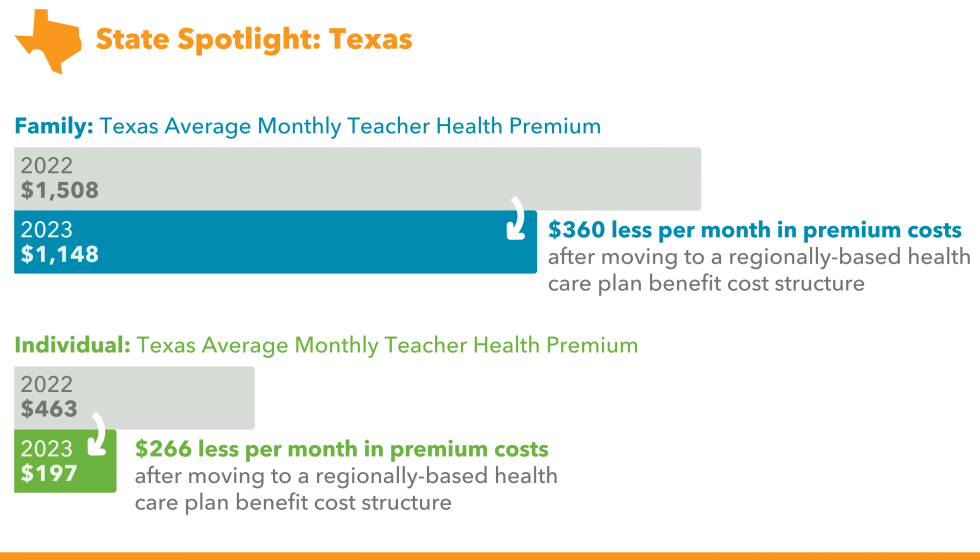
Texas moved to a regionally-based health care plan benefit cost structure. The state was divided into 20 regions in 2023 — and each region has an adjusted premium, deductible and out-of-pocket cost differentiation. This resulted in lower premium costs to teachers on average across the state. However, premiums for family coverage in Texas are still some of the highest in the region. Note: Some (but not all) districts supplement the state contribution to further lower premium costs for teachers.
Teacher Retirement Benefits
 All states offer pension plans to teachers, and most SREB states have pension tiers with varying benefits for newer teachers. Six states now have portable investment or hybrid plan options for teachers — which can allow younger teachers to save more and can also be a cost-saving measure for state budgets by lowering their total unfunded liabilities.
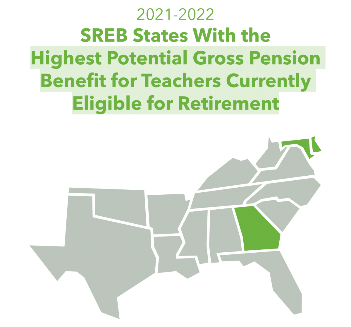
SREB calculates a gross annual pension benefit for teachers for each plan by state. The chart below shows the changes in the regional average gross annual pension benefits for teachers currently at retirement. Nearly all states have lower pension benefit formulas for newly hired teachers, which reduces newer teachers’ gross benefit earning capability.
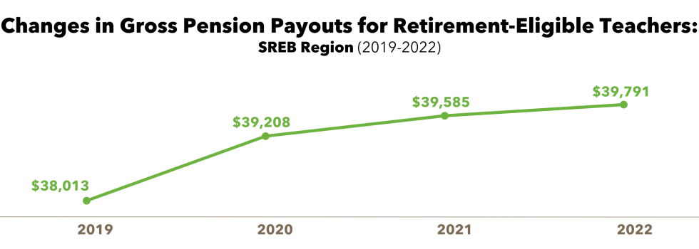
Note: SREB calculates the typical gross annual pension benefit for a teacher in each state at age 65 with 30 years of service (not including Social Security). SREB is unable to calculate potential gross annual investment or hybrid plan benefit due to the high number of variables related to investments and returns.
Teacher Take-Home Pay
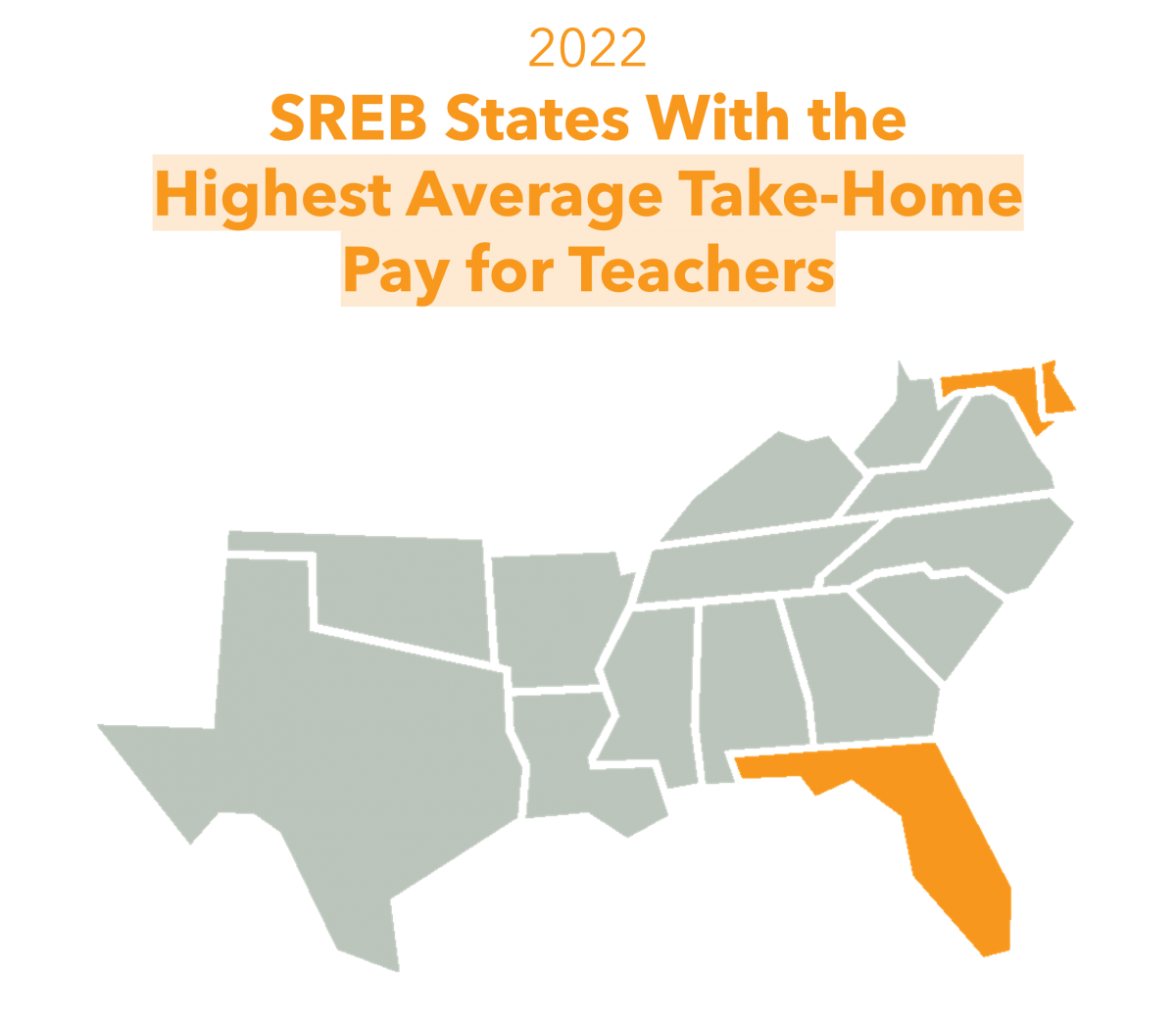
SREB calculates typical take-home or net pay for teachers in each state at different stages in their career.
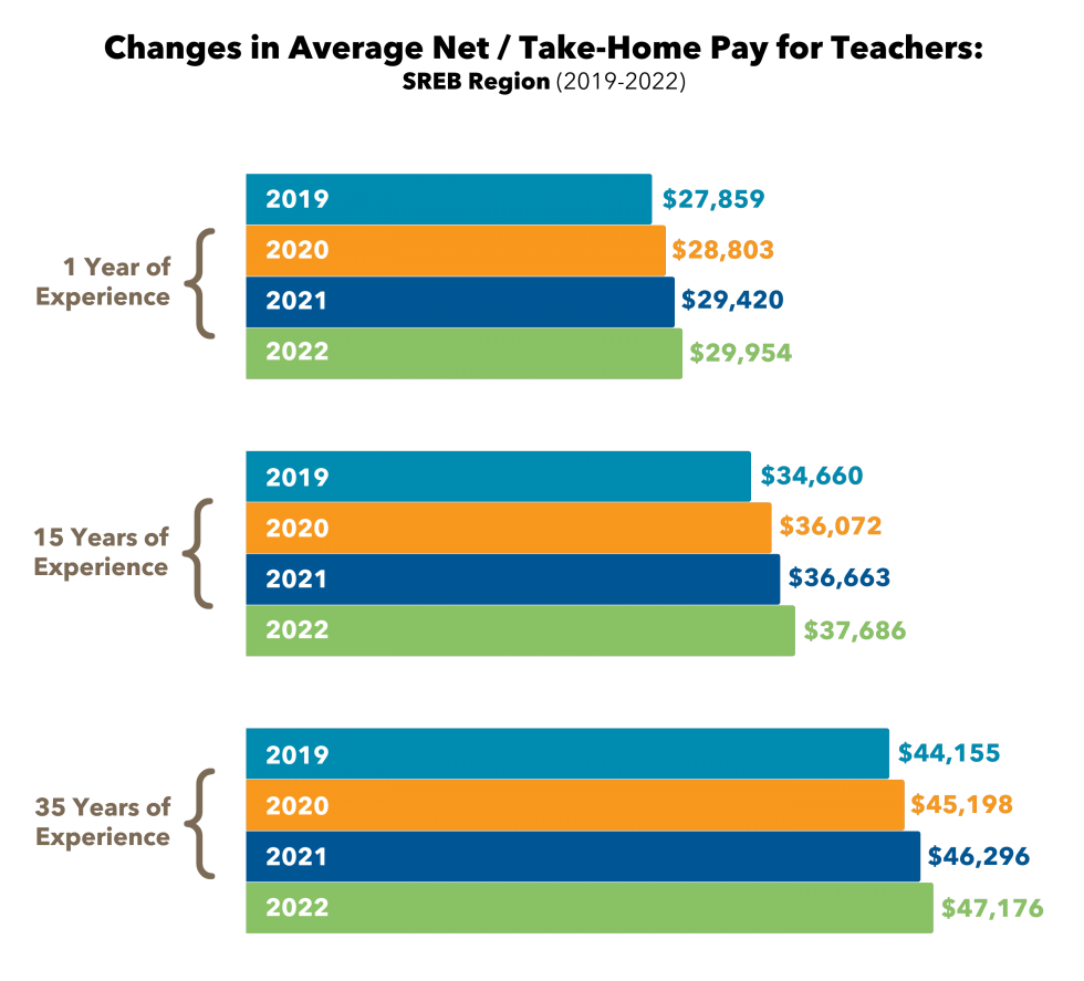
Note: SREB calculates typical net pay for teachers in each state at different stages of their career (gross salary minus benefit costs and taxes) using standard assumptions for age, family, tax status and health needs.
*Sample District Average Teacher Compensation & Local Economic Data
To show how local teacher compensation varies across districts, SREB collected data from a non-representative sample of 48 rural, suburban and urban school districts across the 16 SREB states to look at teachers’ take-home pay in different contexts. Additionally, local economic and cost of living data is included in our analysis to examine how far teachers’ paychecks stretch and the financial implications of their compensation packages.
Teacher Salaries in Sampled Rural, Suburban and Urban Districts
At first glance, average district teacher salaries across the 48 districts do not appear to have a huge range difference. Rural district salaries average $56,262 per year, while suburban and urban districts increase to $60,707 and $63,874, respectively. The average pay discrepancy between the rural and urban districts was over $7,600 – a 14% difference.
Sample District Teacher Pay by Experience and Education Level
Teachers with greater experience and/or more education in the urban districts earned more than their rural and suburban counterparts. Teachers with master’s degrees realized around a $16,500 increase in pay on average in the urban districts after 15 years of service. Those in suburban districts realized a nearly $14,000 increase, and in rural districts nearly an $11,000 increase.
Teachers with a bachelor’s degree experienced similar income gaps. With 15 years of service, teachers with bachelor’s degrees in the urban districts earned nearly $16,000 more, while the suburban teachers earned around $13,000 more. Rural teachers earned around $9,000 more.
Sample District Teacher Health Insurance Costs
There are no consistent options for health insurance for educators based on the 48 districts. States and districts offer varied health benefit options and coverage levels at extremely different costs.
Note: HMO plans selected had the lowest premiums available, but higher deductibles and out-of-pocket costs. PPO plans selected had moderate premiums with a wider network of coverage, as well as lower deductibles and out-of-pocket costs.
Sample District Teacher Take-Home Pay
The average gross teacher salary in the 48 districts was $60,209 while take home pay averaged $40,930 after deductions. After basic living costs for housing, groceries, utilities, transportation and out of pocket health costs, teachers averaged $1,259 in remaining income per month to use for savings and expenses such as childcare and household costs. Rural teachers in the sampled districts had the highest percentage of discretionary income at 27%.
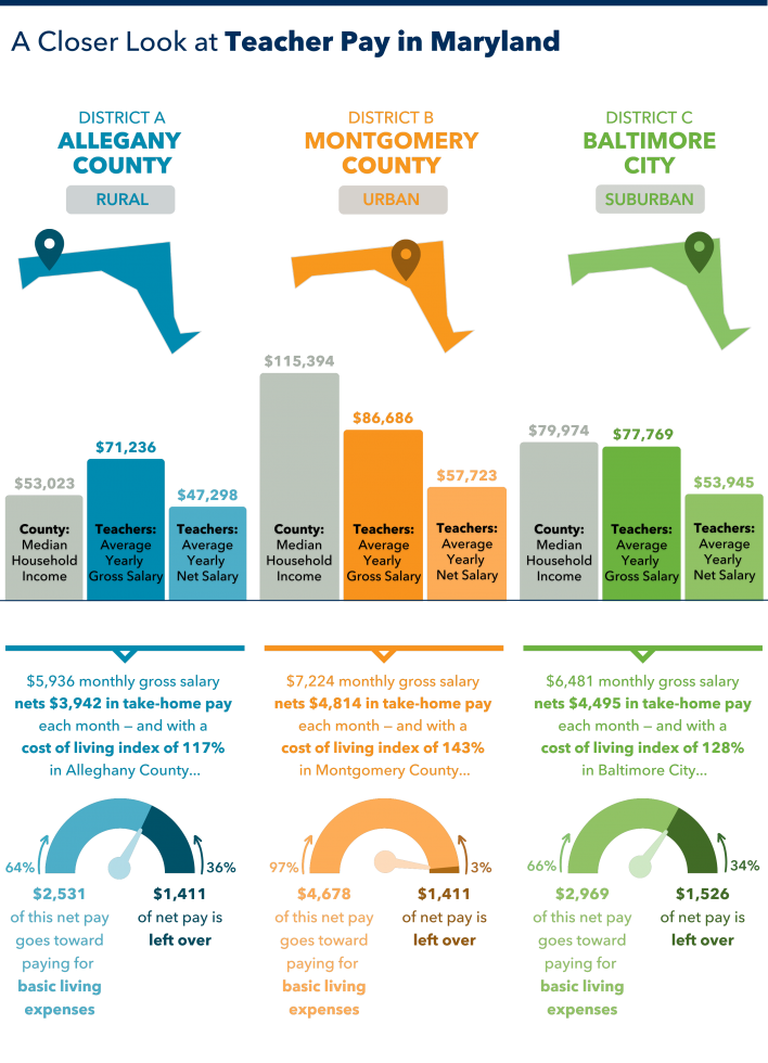
See a spotlight on three district samples from Maryland below.
Note: In the chart below, “basic living expenses” refers to the county’s average cost of housing, groceries, utilities, transportation, and healthcare.